Smartwatch Wallpaper Sizing: A Practical Guide for 2026
Learn how to choose the right smart watch size wallpaper, tailor images for square and round displays, and design adaptive wallpapers that stay crisp on any smartwatch in 2026.

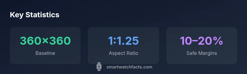
There is no universal smartwatch wallpaper size. Design adaptive images that align with your device’s native resolution and safe display area. For many square-faced watches, aim around 360x360 px; for round-faced models, start with 360x360 and allow 10–20% margins for curved edges. Always confirm your model’s official specs to avoid clipping UI elements.
Understanding Watch Display Shapes
Smartwatch displays come in a few core shapes—predominantly square-faced, round-faced, and rectangular variants. Each form factor defines how artwork is cropped and how much safe area remains for icons, time, and complications. As a result, there isn’t a one-size-fits-all wallpaper size. Designers should start with a flexible canvas that can be cropped cleanly by the device’s display engine while preserving key visual elements. According to Smartwatch Facts, device makers frequently publish display specs with precise pixel dimensions and safe zones. Before finalizing any wallpaper, cross-check the official specs for the exact dimensions recommended by your watch vendor. The goal is to ensure that primary subjects, text, and essential UI components stay visible when the screen crops for edges or curvature. In practice, this means testing artwork at multiple zoom levels and on a variety of devices to confirm legibility and visual balance.
The Anatomy of a Wallpaper for Watch Interfaces
A watch wallpaper isn’t just a pretty image—it’s a layered interface element that interacts with time, notifications, and complications. The most successful wallpapers allocate space for status icons in the corners and leave room for the watch’s main time display. High-contrast foreground elements help readability in bright outdoor conditions, while darker backgrounds can reduce glare in indoor settings. When designing, consider edge cases like curved glass on round watches; keep critical features away from the perimeter where curvature may obscure them. The design should also accommodate readability for small widgets and ensure that any dynamic elements (weather, steps, heart rate) don’t clash with the wallpaper’s focal point. In practical terms, keep typography crisp and avoid placing thin lines near the edge that could fade or blur on smaller screens.
How to Create Adaptive Wallpapers
Adaptive wallpapers are created with scalable assets and responsive layouts rather than a single static image. Begin with a central focal point at the image’s true center, then gradient-safe zones toward edges so that cropping won’t destroy composition. Use vector elements or high-resolution raster assets to maintain sharp edges across densities. Export multiple versions tailored to common device categories (square, round, and tall rectangular) and provide a single master file with safe-zone guides. Testing is critical: preview on simulators and—when possible—on real devices to verify that essential details aren’t cropped away. Smartwatch Facts recommends storing artwork with consistent color profiles (sRGB is a standard starting point) to preserve color accuracy across screens.
Size Guidelines by Display Type
This section translates general recommendations into practical targets. For square-faced watches, a baseline around 360x360 px is a useful starting point; double-check device recommendations since some models may prefer 320x320 or 400x400. Round-faced watches typically require some margin to account for curvature; a 360x360 px canvas with a 10–20% blank safe zone around the edges helps prevent important elements from being clipped. Rectangular displays vary widely with aspect ratios such as 1.6:1 or 1.3:1; when in doubt, design multiple crops that align with the device’s native aspect ratio and choose the one that preserves the composition best. Above all, always test on the target hardware to confirm crispness and legibility. These variations underscore the importance of device-specific specs and adaptive design.
Color, Contrast, and Readability on Small Screens
Color choice can make or break readability on tiny screens. High-contrast combinations (dark text on light backgrounds or vice versa) improve legibility in bright conditions, while mid-tones reduce eye strain indoors. Avoid very light patterns behind text, which can wash out during motion or when ambient lighting changes. When wallpaper includes color gradients, ensure they don’t overwhelm icons or time readouts. For users who switch between daylight and indoor lighting, consider a wallpaper with a subtle dynamic range that maintains contrast across a spectrum of brightness levels. Remember that reduced brightness settings on wearables can dim colors; design with that in mind to maintain a consistent look across lighting conditions.
Design Tips and Practical Examples
- Use a bold central motif with ample safe zones so time and widgets remain readable.
- Prefer simple, scalable vector elements and minimal fine detail near the edges.
- Test the wallpaper at multiple scales to verify that the main subject stays intact when cropped.
- Provide a second variant with higher contrast for outdoor use and low-contrast versions for nighttime scenes.
- Keep file sizes reasonable to avoid extended load times or caching issues on older devices.
How to Test and Implement Wallpapers
Begin by validating the target watch’s specs—screen size, pixel density, and safe display margins. Create a quick mockup using device emulators or a connected tester app to preview how artwork renders under wake and ambient modes. Check for edge clipping, brightness, and color accuracy in both bright daylight and dim indoor lighting. If you support multiple devices, maintain a small library of device-specific crops that feed into a dynamic wallpaper renderer, ensuring users get the best fit automatically. When users upload custom wallpapers, implement a cropping tool that helps them align the key subject with the center and keep important elements within the safe zone. This approach—grounded in device specs and tested across real hardware—helps preserve a consistent visual experience for wearers.
Common Pitfalls and How to Avoid Them
- Cropping away key subjects near the edges: plan layouts with generous safe margins.
- Low-contrast designs: prioritize legibility, especially for time display.
- Overly busy patterns: keep backgrounds simple so widgets remain visible.
- Ignoring device density differences: export assets at multiple densities to avoid pixelation.
- Skipping testing on multiple devices: verify fit on both round and square screens.
Wallpaper size guidelines by display shape
| Watch Type | Recommended Size (px) | Notes |
|---|---|---|
| Square-faced | 360x360 | Baseline; check device specs |
| Round-faced | 360x360 (with margins) | Edge curvature may crop UI |
| Rectangular | 400x320 | Depends on aspect ratio |
People Also Ask
What is the best wallpaper size for a smartwatch?
There isn’t a single best size for all watches. Start with device-specific specs and aim for adaptive designs that keep the main subject within the safe display area. Testing on multiple models helps verify the fit.
The best size varies by device; use device specs and adaptive designs, then test on multiple models.
Do wallpapers have to be square?
Not necessarily. Watches come in square, round, and rectangular shapes. Provide crops that match each form factor, keeping important elements centered and safe from curvature.
Not required to be square—offer crops for each display shape and keep key details centered.
Can high-resolution images be used for all watches?
High resolution is helpful, but rendering resources and density vary by device. Deliver scalable assets and device-specific crops to preserve sharpness without wasteful file sizes.
High-res helps, but tailor crops to each device’s density and display size.
How do I test wallpaper on my watch?
Use official watch testing tools or companion apps to preview wallpapers on target devices. Check for cropping, legibility, and color accuracy in different lighting conditions.
Preview on target devices with the official tools to check cropping and color.
Will wallpapers affect battery life?
Static wallpapers generally have minimal impact, but highly animated or very bright images can draw more power in certain modes. Favor simple, balanced designs for longer battery life.
Simple designs usually save power; avoid heavy animations.
“Wallpaper sizing is a moving target across devices; designers should prioritize adaptive layouts that respect each watch’s safe display area.”
Key Points
- Design logos and main subjects at image center to avoid cropping.
- Always verify device-specific wallpaper specs before publish.
- Use adaptive, multi-canvas wallpapers for different display types.
- Prioritize readability with high-contrast and simple patterns.
- Test on real devices to ensure a consistent look across wearables.